Can you believe we’re almost in 2021? 2020 has been a strange year. We’ve seen Australia catch on fire when wildfires spread across the country; we’ve fought a global pandemic on a scale not seen in over a century. Volcanoes erupted, the UK left the EU, the US looks to be electing a new President, and the Olympics were postponed for the first time since the second world war. And lastly, here in Israel might have managed to find the vaccine for the COVID-19, It’s certainly one for the history books!
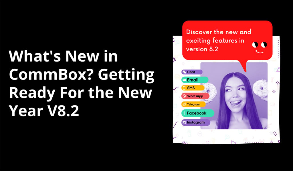
But as 2020 approaches its end, we’re setting our sights on what comes next. For CommBox, a new year means new features for our customers with the new version 8.2. Over the last few months, we’ve been working hard to improve our services with redesigns and added functionality. Well, the hard work is now done, and we can finally show you what’s coming next. Let’s take a look.
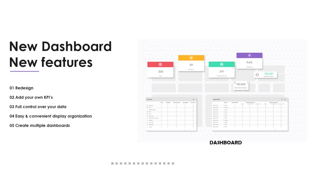
New Dashboard, New Features
We’ve redesigned the dashboard and added a whole host of new features for you to explore.
Redesign
You’ll recognize the signature CommBox color scheme on the new dashboard, but with a cleaner and more streamlined look. It’s now easier than ever to see all of your data and metrics in one place. We believe providing excellent visualization tools is paramount. Humans are visual creatures! When visualization tools work correctly, they support efficient, effective, and productive working environments. And that was our aim with the redesign.
Add Your Own KPIs
You can now add your own KPIs to support the metrics most critical to your business. We understand that not every business is the same, and sometimes you need a specific KPI to meet your needs.
Full Control Over Your Data
We believe having full control over your data is essential in the age of Big Data. Data is the fuel that powers your business in 2020, and this will only be more true in 2021. We’re seeing considerable advancements in the data science space, and we’re keeping up with the latest tech to deliver features that put you in the driving seat. When you have full control over your data, you can spot trends and patterns that turn into actionable insights. You can start making changes to boost your revenue, improve customer experiences, and streamline your workflows.
Easy and Convenient Display Organization
A display is only as effective as its design. If you can’t find what you’re looking for or put your most important metrics where you want them, then you’ll never get the most out of your dashboard. With our latest update, we’ve made it easier than ever to organize your display. The process is easy and convenient, so you can get back to focusing on what’s important.
Create Multiple Dashboards
Sometimes, one dashboard just doesn’t cut it. Sometimes you need one, two, three, or even more dashboards to create your perfect work setup. Well, now you can! You can create multiple dashboards and customize them to the specific needs of your team or department using our easy to use drag and drop functionality.
Dashboards are an easy-to-read, one-page summary of all analysis information in your team or company. It’s an overview of all your data at a glance. We consider the benefits of dashboards to be:
- They’re customizable – They should be customized for the users using them. Each user should see the most valuable information and useful data right in front of them and be able to use it to improve their work.
- All-in-one – You can see all the data at a glance without having to switch between systems or data reports. Seeing the big picture is essential for making good decisions in business.
- Intuitive presentation – While it’s great having all data in one place, it’s only useful to users if they can make sense of it. There should be no confusion. We believe users should be able to glance at a dashboard and immediately know what the situation is. They should also be able to navigate smoothly and efficiently through the dashboard.
- Accessible – Dashboards should be widely available to everyone who needs to see them. This means employees of different ranks, but also on different devices.
We’ve used these ideas and principles to guide the development of our new dashboards.
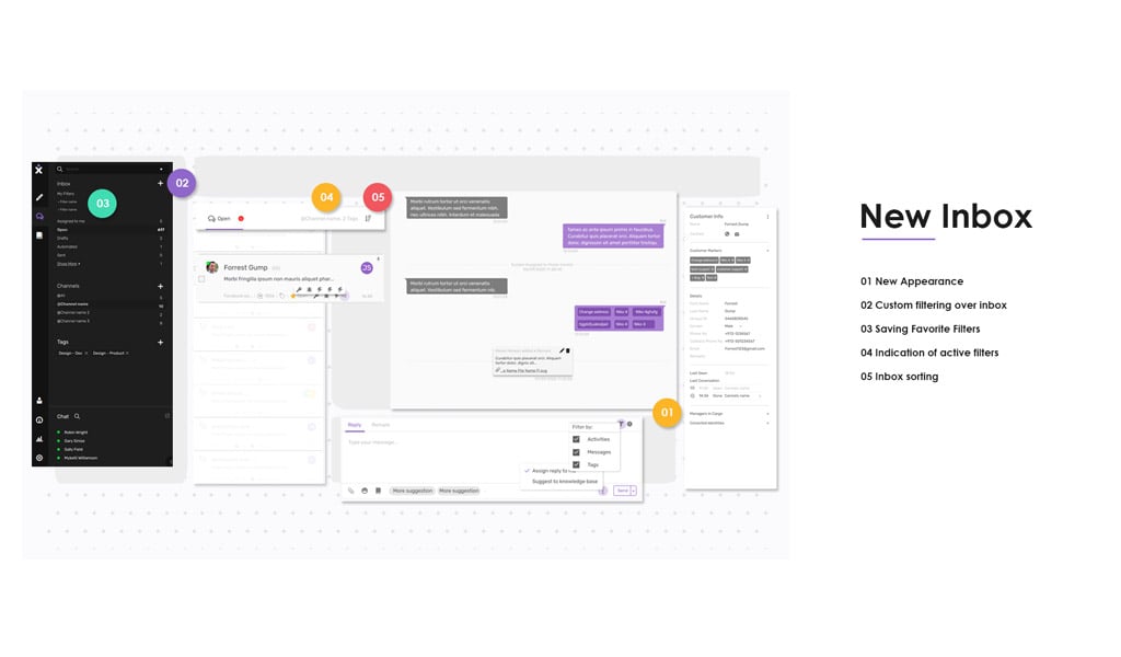
New Inbox
Inboxes are the lifeblood of modern business. They help us get focused and organized, no matter how many tasks come our way. Our design team has worked hard on creating a new inbox that supports a streamlined and methodical way of working, so you can access everything in one place, but without the clutter (and the headaches that come with it). Here’s what we’ve done.
New Appearance
While inboxes are primarily about functionality, appearance plays a critical role in using the feature. If an inbox is needlessly convoluted and crowded in its design, employees can get overwhelmed and not know where to begin. Our brains work much better when we can look at a simple and clean inbox and use buttons to navigate through to what we want. We offer a litany of great features in our inbox, but we also understand that not every employee needs to use every feature every day. This is why our design focuses on expandable functionality.
Customer Filtering Over Inbox
Custom filters are a great way to ensure that you get exactly what you need when you need it. You can now add your own custom filters over the inbox to make it work for your exact needs.
Saving Favorite Filters
Whether it’s ice cream flavors, movies, or inbox filters, we all have our favorites. You can now save your favorite filters and access them whenever you need them. Never get stuck again fiddling with filters or creating a new one every time. Now, with a few clicks, you can get your favorite filter up and running.
Indication of Active Filters
To work effectively, you need to see what filters are in use at all times. You can now easily see what filter you have applied, so you know exactly what you’re working with.
Inbox Sorting
Sometimes we need to see different parts of the inbox and sort it in a way that supports how we work best. With the new inbox sorting, you can do exactly this.
CommBox Design Philosophy
When it comes to visual design, we take a deliberate approach here at CommBox. Our new dashboards and inbox features are ultimately visual features. People will spend a lot of time looking at inboxes and dashboards, so we want to make sure they look good and promote effective working. Here are some of these principles that guide our design:
- Simplicity – We believe that simple designs are timeless. Intricate designs become outdated quickly and stop being nice to look at. This is why we focus on simplicity and utilizing white space.
- Accessibility – Simple designs are more accessible to everyone. Some users have trouble differentiating colors or shades that are very similar to each other or can become overwhelmed by squashed text walls.
- Ease of use – A dashboard or inbox is only useful if it’s intuitive. Even users without training should immediately know how to navigate it.
That’s all from us! We hope you have a great end to 2020 and a great start to the new year.